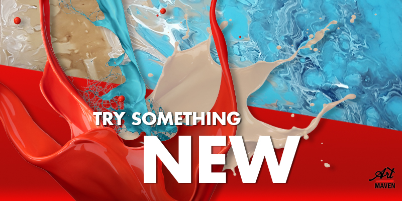
Try Something New - Cell Pouring
Have you seen this craze about how people pour different colours of paint into a cup and just dump it all over a canvas but the result that comes out is so beautiful? Crazy enough how none of the colours mix and make these funny little cells! Well I recently found a place offering a workshop and thought WHY NOT?!
We all need some inspiration and my recent blog on 10 Tips for Finding Inspiration says
that you need to try something new which is exactly what I did! It was the very
first workshop I’ve attended and it was so exciting to be part of something
that I think is such a cool idea. Learning a lot about paint which I don’t really
like doing but might start with in the near future. For this painting
technique, whether it be for a professional or intermediate artist (or not even
an artist) is such an easy style to learn, just going crazy with it. Like I said
you don’t even need to be an artist, just combining eccentric colours could
leave a beautiful result.
My aunt who is a bit of an artist herself joined me but even
for her who can’t draw the things I can she found it very easy, relaxing and
fun to do. She loved every second of it and made some new friends along the
way. We arrived getting, a 450mm x 450mm square, small frame and a small tile
to do all of our practicing on.
Our first pour on our tile was quite scary but we were more excited than anxious. We didn’t want to mess it up but let’s face it in the end it can either be a hit or miss with this technique as your paint keeps pouring off and moving as it dries. So if you thought it’s going to be green it might look a bit more blue than usual but still beautiful depending on the colours and amounts you used. Like they say practice makes perfect and I think that our first encounter and results with this type of painting style was quite good.
 |
| My Aunts Tile |
 |
| My Tile |
My aunts one came out so nice that everybody who came past loved hers so much and couldn’t stop swooning about how beautiful her colour choices were, but mine which I thought would be redder came out being just pink!
In my video you can see that I had magenta, white, pink and some orange but when you see the result it looks pinker. Not even a trace of orange! And believe me before I took the picture of the end result it was like JUST PINK! I blew on the paint to reveal more of the hidden paint underneath so it wouldn’t look so girly. I’m not really happy about the end result maybe because of the pink but it can still be used and is still a great example. Maybe one day I could do a re-pour if I feel like it?
 |
| My Aunts |
 |
| My now not so VERY PINK frame |
My aunt did it and the most beautiful purples, yellows and reds came alive all on one canvas. They blended so well and she didn’t even plan her colours! She loved the end result and so did everyone else.
 |
| My Aunts beautiful piece |
So after careful consideration, as if this was a life choice, I decided to pour the brown first on the left and manipulating/ tilting the square to have the desired effect before moving onto the second cup. (When I first poured it, it looked like chocolate.) Pouring the second one I made sure to have the blue and brown mix in the center to look like the ocean is meeting the beach. The end result was perfect just like I wanted it to be. Different to the other workshop attendees and just awesome.
 |
| My beautiful piece |
Our next step is to put some glaze over to make it look
shiny as the paint we used like craft, acrylic and fabric goes a bit dull after
it dries. Will definitely post the final results and some more examples soon so
stay tuned!
Check out my website, Facebook and Pinterest for some more fun news and art inspiration ideas!
Check out my website, Facebook and Pinterest for some more fun news and art inspiration ideas!


Comments
Post a Comment